Experience Revamp of Oracura - Ecommerce Website (Mobile version)
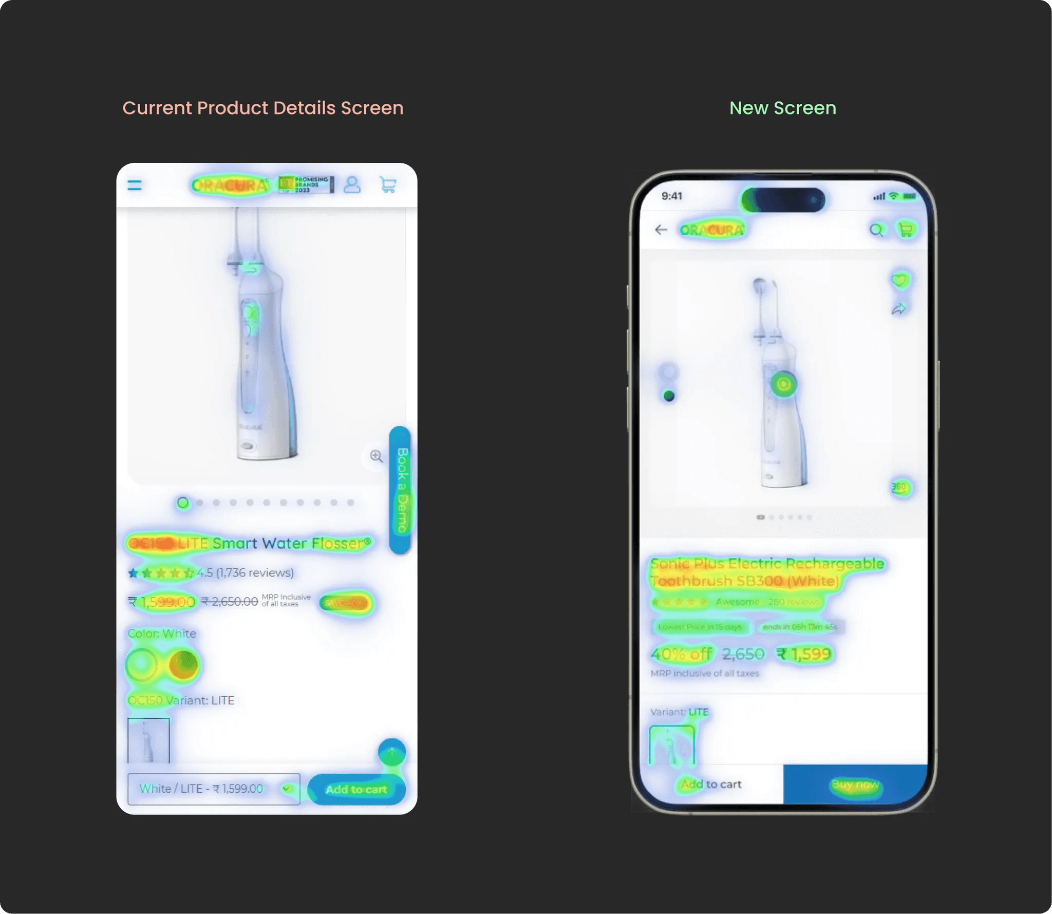
A/B testing showed a 70% boost in usability and improved user focus on the product details page.
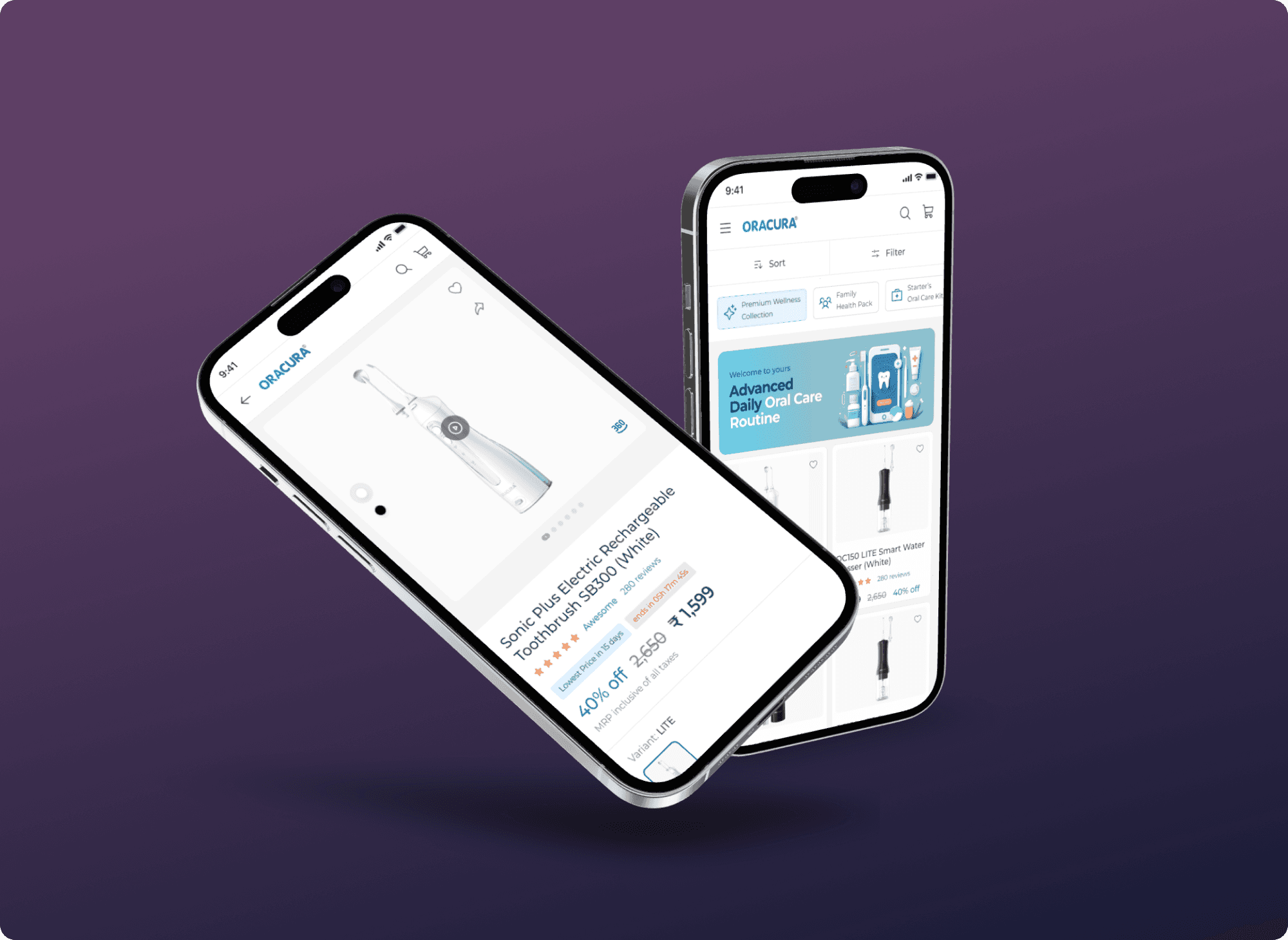
The mobile version of Oracura's OC150 Lite Smart Water Flosser product page is failing to captivate users beyond the initial view. This lack of engagement limits users' understanding of the product's value proposition and inhibits their likelihood of making a purchase decision.
Little background about the problem
The mobile product page for Oracura’s OC150 Lite is not engaging users beyond the first view. The goal is to identify key UX issues and redesign the page to improve clarity, usability, and user engagement.
Design Process
I followed a structured, user-centered design approach to understand the problem, ideate solutions, and test outcomes. Here's a breakdown of my process:
🔎 Research & Insights
Applied Design Thinking to identify UX issues through behavior analysis and card sorting. This helped uncover why users weren’t engaging beyond the first fold and clarified the content hierarchy needs.
✏️ Design Decisions
Focused on a minimalist, mobile-first approach, using visual hierarchy and interactive cues to guide attention. Integrated layout improvements and visual storytelling to improve engagement across key sections.
🧪 Prototyping & Testing
Used Figma for prototyping and validated the new design with Zyro, testing for clarity and usability. Based on feedback, fine-tuned elements to ensure smoother interactions and higher user retention.
Discover more Information
I started with casual interviews with my friends to understand how they shop for personal care items online. One of them was actively looking to buy an electric toothbrush, which gave real-time insights into decision-making and expectations.
To define clear design goals, I conducted two key research methods:
User Interviews to understand pain points and shopping habits.
Card Sorting to organize content by user expectations and mental models.
I analyzed how leading and emerging platforms present similar products. This included:
Flipkart and Amazon for their UI patterns and trust signals.
Competitors like TUSK and Dr.Dento to identify gaps and features that stand out or fail to engage.
Defining the major UX issues
I had gathered a lot of information from all the research and analyzed to define the major issues on this projects.
UX-Issues listed:


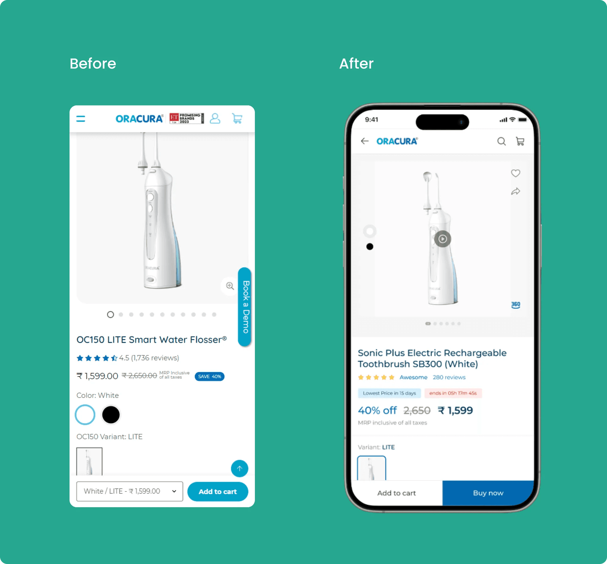
In Product Details Page
Top menu section
The top menu feels cluttered with too many items, and there's a color contrast issue when accessing the profile and cart menus.
Search option is missing
Product cards: The page has too much whitespace, and there's no product video available. Additionally, the option to share the product is missing.
Additional CTA: The "Book a demo" button is dominating the space and overshadowing other important details. This may mislead users from the primary action of purchasing or adding items to the cart.
Product details: The information architecture and color psychology need improvement.
Bottom actionable menu bar: The absence of a "Buy now" direct action results in additional clicks, as users are required to navigate to the cart section.
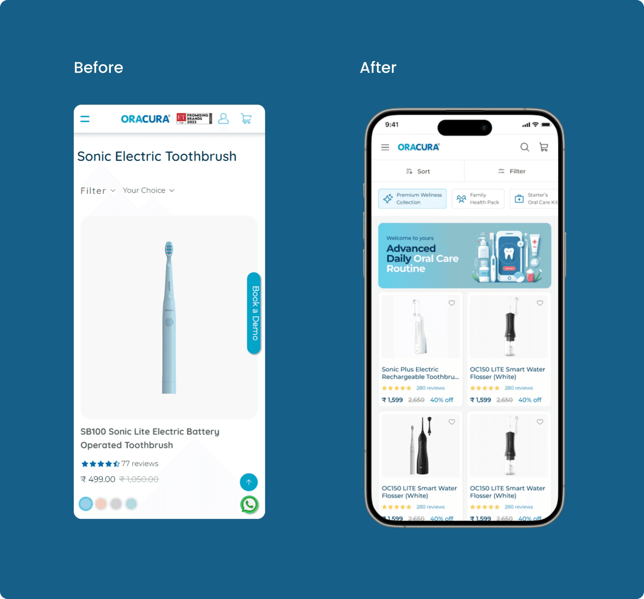
In Product Listing Page
Product name: Issues with alignment and padding, requiring adjustment for a more visually cohesive presentation.
Filter and Sort options: Identified lack of alignment and scalability in filter and sort options, highlighting the need for realignment and scalability enhancements.
Product showcase: Presenting alignment challenges and scalability issues in the product showcase section, prompting the need for refinement.
Banner image: Quality concerns and a lack of visual appeal observed in the banner image, requiring an update to make it more engaging and attention-grabbing.
Proposed Design Solutions
After deep brainstorming sessions, it's clear that the main focus should be on enhancing the experience for the Product screen, as users will spend 80% of their time using the website.
Main issues to be solved were identified and is shown below.